
GPT IMAGE 2.5 vs GPT IMAGE 2

Updated: 2 days ago
What really improved with GPT IMAGE 2.5?
AI image models are getting better quickly, but release notes rarely answer the question that matters when creative teams actually work with them: does the upgrade actually change the way you work?
With GPT Image 2.5, the interesting improvements are not only about generating a prettier image from scratch. OpenAI has positioned the new generation around stronger visual quality, more reliable editing, better reference fidelity, and better handling of complex visual instructions.
So instead of testing GPT Image 2.5 with isolated prompts, we built a small production style experiment.
We compared GPT IMAGE 2.5 vs GPT IMAGE 2 using the same visual references and closely controlled prompts. Then, once we had a base image, we pushed GPT Image 2.5 through several consecutive edits to see how much of the original image survived when we started changing specific variables.
What we tested using GPT IMAGE 2.5 vs GPT IMAGE 2?
The tests focused on four areas:
Visual quality, realism, and style adherence
Precision when modifying specific elements
Consistency across consecutive edits
Complex structures generated from highly detailed prompts
The goal was not to make GPT Image 2 look worse. In fact, that became one of the most interesting parts of the experiment: GPT Image 2 is already very capable. In several tests, the difference between generations was much smaller than expected at first glance.
The improvements became more apparent when we stopped looking only at the full image and started looking at material behavior, lighting, structural detail, and what happens after multiple edits.
Visual Quality, Realism, and Style Adherence
For the first test, we generated the same type of fashion portrait in GPT Image 2 and GPT Image 2.5.
The direction was deliberately specific: a close-up editorial portrait, black cat-eye glasses, slicked-back hair, a black turtleneck, and a strong green atmospheric light source coming from behind the subject.
This test was useful because it combined two things we wanted to evaluate at once:
photographic realism and the ability to hold a clear art direction.
What We Found
At first glance, the difference is not dramatic.
Both images are convincing fashion portraits. Both understand the green backlight, the black wardrobe, the eyewear, the clean composition, and the futuristic editorial mood. That matters because it immediately puts one claim into perspective: GPT Image 2.5 does not make GPT Image 2 suddenly look outdated.
The difference appears in the refinement.
GPT Image 2.5 produced slightly richer facial texture, cleaner material separation, and more controlled transitions between the bright green source, the skin, the glasses, and the black fabric.

The lighting also feels somewhat more integrated into the physical scene. Instead of simply tinting the image green, the illumination interacts with the contours of the face and creates more convincing falloff around the jaw, cheeks, hairline, and garment.
Where we saw the bigger improvement was style adherence.
The 2.5 result held the intended editorial direction particularly well. The glossy eyewear, sculpted facial light, restrained expression, smooth background, haze, and black silhouette all feel like parts of the same photographic language.

That distinction is subtle, but useful in campaign work.
A generation model does not necessarily fail when it generates a good looking image that differs from your direction. It fails when you need ten images that all belong to the same visual world and each generation slowly moves somewhere else.
GPT Image 2.5 appears better equipped for that kind of workflow.
The Prompt
Use Image A as the visual reference. Create a new image inspired by the same subject styling, mood, composition, and lighting language, but do not reproduce the image exactly. The goal is to generate a fresh high-end editorial portrait with the same overall aesthetic: futuristic, minimal, atmospheric, and fashion-forward.
Create a close-up fashion-beauty portrait of a young woman framed from the chest upward or from the shoulders upward. She should face forward toward the camera with a composed, elegant, emotionally controlled expression. Her face should feel symmetrical, refined, and sculptural, with smooth skin, softly defined cheekbones, a straight nose, and full neutral-toned lips. The expression should be serious, poised, and slightly distant, with a cool editorial attitude.
Her hair should be dark, sleek, center-parted, and tightly pulled back. The hairstyle should be smooth and minimal, contributing to the futuristic clean styling of the portrait. No loose hair strands should distract from the face.
She should be wearing black narrow cat-eye sunglasses or slim angular fashion sunglasses with dark tinted lenses. The eyewear should sit high on the nose and feel sharp, minimal, and contemporary. The glasses should be one of the main styling features, contributing to the image’s modern editorial feel.
Her wardrobe should be a black high-neck garment, such as a black turtleneck or close-fitting high-collar top. The garment should be minimal and understated, blending into the darker lower part of the frame and keeping visual emphasis on the face, glasses, and lighting.
The composition should be centered and clean, with the face dominating the frame. The camera should be straight-on or slightly off-center, with a premium beauty/editorial feel. The image should have a shallow depth of field or soft atmospheric focus around the edges, while preserving facial clarity and the strong graphic silhouette of the glasses.
The key visual feature must be the lighting. Use dramatic moody green lighting with a cinematic glow. The color palette should revolve around soft green, yellow-green, and muted acid-lime illumination. Add a strong atmospheric bloom or diffused luminous haze that rises from the lower-left area of the image and partially washes across the face. The glow should create a dreamy, almost synthetic atmosphere without obscuring the facial structure. The lighting should feel diffused, futuristic, and intentional, not like a simple colored gel.
The background should be extremely minimal: a smooth soft gradient or blurred studio backdrop in greenish tones, with no visible objects. The mood should be sleek, modern, and slightly mysterious. The face should emerge from the colored haze with subtle highlight shaping across the cheek, lips, and brow.
Render the skin realistically with refined detail, but allow the atmospheric lighting to slightly soften edges and create a polished editorial finish. The overall look should feel like a premium fashion campaign or beauty editorial image shot in a controlled studio environment with colored light and soft diffusion.
The final image should be luxurious, minimal, cinematic, and highly realistic. No text, no logo, no watermark, no extra accessories.
Modifying Specific Elements Without Losing the Image
Generating a good image once is useful.
Being able to change one or two specific things without rebuilding everything else is considerably more important for production.
For the second test, we took the green GPT Image 2.5 portrait and requested two changes:
Turn the green lighting into dark electric blue
Replace the narrow black glasses with oversized blue rectangular frames

What changed correctly
The lighting palette shifted dramatically from yellow/green to saturated electric blue.
The model recreated the same general lighting logic: bright backlight, atmospheric bloom, cool spill around the silhouette, and dramatic contrast against the black turtleneck.
The sunglasses were also replaced successfully. The original slim black cat-eye frame became a thick, glossy blue rectangular frame while still fitting the subject's face naturally.
What stayed consistent
The important success was everything that didn't change.
The model retained:
the same general facial identity
center parted slicked back hair
black high neck wardrobe
neutral expression
atmospheric photographic treatment
general facial proportions
Where there was still drift
It was not a pixel-perfect edit.
The second image became slightly tighter and more frontal, and there were small differences in facial framing and surrounding atmosphere.
GPT Image 2.5 is becoming much better at preserving the concept and identity of an image, but that is not the same thing as deterministic compositing or Photoshop-level pixel locking.
That is a meaningful difference in workflow.
Traditionally, changing something as fundamental as both the hero accessory and the lighting scheme could effectively turn into another generation. Here, it behaved more like a targeted creative revision.
The Prompt
Use Image A as the direct edit target and Image B as the sunglasses reference. Edit the portrait while making only the following two changes, and preserve everything else exactly.
Change 1: Replace the current green atmospheric lighting with a deep dark electric blue lighting design. The entire lighting mood should shift from green to rich cool electric blue while preserving the same editorial atmosphere, cinematic bloom, and luminous haze structure. Keep the same soft diffused glow rising through the frame, the same moody studio ambience, and the same sense of futuristic fashion portraiture, but now expressed through intense dark electric blue, cool cobalt-blue, and slightly neon blue tones. The result should feel darker, cooler, and more dramatic, while maintaining the same visual logic of the original lighting setup.
Change 2: Replace the current black narrow cat-eye sunglasses with oversized glossy blue rectangular sunglasses inspired by Image B. The new glasses should have a thick, bold, fashion-forward rectangular frame in vivid blue acetate. The frame should be chunky, sculptural, and highly visible. The lenses should remain dark or deeply tinted. The overall look of the glasses should be statement fashion eyewear, much bolder and more graphic than the original pair.
Everything else must remain unchanged: preserve the same woman, same identity, same face shape, same lips, same expression, same hairstyle, same center-parted pulled-back hair, same black high-neck garment, same pose, same camera angle, same framing, same background structure, and same overall fashion-editorial quality. Do not change the subject’s anatomy, age impression, styling attitude, or composition.
The edit should feel extremely precise: only the lighting color palette and the sunglasses design should change. The image should still look like the same portrait from the same shoot, just with the two requested modifications.
Do not add extra accessories, jewelry, text, logos, or any other styling changes.
Consistency Across Consecutive Edits

The next test pushed this idea further. Instead of making one edit, we wanted to know what happens after multiple revisions to the same image. This is a common weakness in generative workflows.
So we created an urban fashion photograph of a cyclist and progressively modified it.
The important visual anchors were:
the rider
facial profile
buzz cut
olive messenger bag
bicycle
riding position
elevated camera language
Edit 1: Changing the Outfit
We first replaced the original black jacket and brown cargo trousers with an oversized blue shirt and loose black trousers. The result maintained the subject surprisingly well. Even the elevated viewpoint and diagonal street-lighting language stayed close to the original. This is where GPT Image 2.5's reference fidelity becomes much more practical. The model was asked to behave as if the existing cyclist had gone back into wardrobe and changed clothes. And visually, that is largely what happened.
The Prompt
Use Image A as the direct edit target and Image B as the outfit reference. Edit the image while preserving the same male model, the same bicycle, the same beachside location, the same pose logic, the same camera angle, and the same premium editorial photography style.
Change only the outfit. Replace the current clothing with the look shown in Image B. Dress the model in an oversized light blue long-sleeve button-up shirt with a relaxed drape, open collar, chest pocket, rolled cuffs, and a slightly wrinkled lightweight fabric texture. Pair it with oversized black wide-leg trousers that fall loosely and cleanly through the leg. Finish the look with clean white low-top sneakers.
The clothing should fit naturally on the subject while he remains on the bicycle. Show realistic fabric behavior, including folds, bunching, drape, and compression that respond to the riding posture. Keep the styling minimal, modern, and fashion-forward.
Preserve the same model identity, buzz cut, face, body proportions, bicycle, and environment. The final image should still feel like the same editorial shoot, with only the wardrobe changed.
No text, no logos, no watermark, no extra people.
Edit 2: Changing the Environment
We then took the cyclist out of the city and moved him to a beachfront environment. This was a more difficult transformation because the background affects perspective, lighting, horizon placement, context, and composition simultaneously.
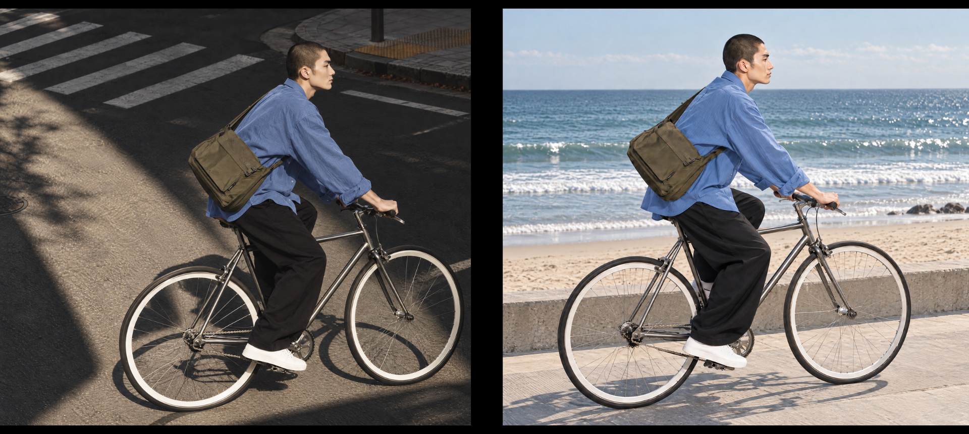
The model still maintained the same basic rider, bicycle, bag, outfit, and visual identity. But...
The camera moved. Despite explicitly instructing the model to preserve the elevated camera position, the beach version became noticeably more side-on and closer to eye level.
The overall framing changed.
The rider to bicycle relationship remained recognizable, but the geometry of the original composition did not remain fully locked.
This gave us an important distinction:
GPT Image 2.5 is currently better at preserving semantic identity than exact spatial identity.
In other words, it understands:
“This is the same man, on the same kind of bicycle, wearing the same clothing.”
better than:
“Every object must remain at exactly the same coordinates relative to the camera.”
That is still very useful, but it is important to understand the difference.
The Prompt
Use Image A as the direct edit target. Edit the image while preserving the same male model, the same bicycle, the same outfit, the same pose logic, the same camera angle, the same composition, and the same premium editorial photography style.
Change only the setting. Replace the city street environment with a clean beachside location. The subject should now appear near the beach, riding or balancing on the bicycle on a firm realistic surface such as a coastal promenade, paved beachfront path, or smooth boardwalk edge. Show pale sand, ocean water, and open sky in the background. The beach environment should feel calm, minimal, and aspirational.
Preserve the original camera angle very closely. Keep the same slightly elevated viewpoint looking down at the subject and bicycle from above. Maintain the same vertical framing, the same three-quarter side view, and the same composition structure. Keep the bicycle and rider positioned similarly within the frame, with the bike geometry still reading clearly. Do not change to a frontal shot, eye-level portrait, low-angle perspective, or wide environmental shot. The result should feel like the same image captured from the same photographer position, only with the location changed from city street to beach.
Preserve the same subject identity, buzz cut hairstyle, facial profile, messenger bag, bicycle, and outfit. Maintain the same editorial mood and strong realistic fashion-photography quality. The result should look like the same photoshoot moved from a city street to a beach.
No text, no logos, no watermark, no extra people.
Complex Structures With Detailed Prompts
For the final test, we deliberately moved away from faces and fashion. We used a macro photo of a parrot tulip.
A flower may sound like an easier subject, but this particular image contains an enormous amount of structural complexity:
overlapping petals
translucent tissue
irregular edges
folds at multiple depths
fine longitudinal veins
pink coloration following the petal structure
transitions between green stem tissue and pale petals
shadows created by layers folding over one another

This makes it a useful stress test for how well an image model can interpret a long, highly specific prompt without collapsing the structure into generic detail.
We ran the same detailed direction through GPT Image 2 and GPT Image 2.5.
GPT Image 2

The GPT Image 2 result is already impressive.
It is realistic, detailed, and clearly understands the type of flower.
However, some areas feel slightly flatter. Certain petal textures become more uniform, and some of the fine structural information feels repeated rather than organically varied.
This is an important distinction when discussing generative realism.
Adding more lines, pores, fibers, or wrinkles does not automatically make something more realistic.
Natural objects contain structured irregularity.
Veins change direction. Thickness varies. Some surfaces catch light while adjacent surfaces disappear into shadow. Edges dry unevenly. Petals overlap in ways that change how light passes through them.
GPT Image 2.5
The 2.5 image handled those interactions more convincingly.
The petal structure feels more layered and dimensional. There is greater differentiation between broad outer petals, narrow curled sections, translucent edges, shaded folds, and the denser tissue around the center.
The pink coloration also follows the structural flow of the petals more naturally rather than reading as a simple color overlay.
Most importantly, the flower contains more variation within the detail.
That is where the improvement becomes visible.
Not more detail for its own sake. With betterorganized detail.
The Prompt
Using the provided flower reference as the visual foundation, create a new macro botanical studio photograph of the same type of pale parrot tulip. Do not simply reproduce the reference composition. Create a fresh photograph while preserving its botanical character, color palette, fragility, and sculptural quality.
The goal of this image is PHOTOGRAPHIC AND MATERIAL REALISM rather than stylization.
Depict one mature parrot tulip on a long curved green stem against a completely black studio background. The flower should feel like a real physical specimen photographed at extremely high resolution, including the tiny irregularities that distinguish living plant tissue from digitally rendered material.
FLOWER STRUCTURE:
The bloom must consist of many overlapping, organically deformed petals with strongly irregular shapes. Avoid symmetry. Each petal should bend differently according to its thickness, weight, age, and position inside the flower.
Some petals should curl outward, others fold inward, several should twist slightly around their longitudinal axis, and a few edges should sag under their own weight.
The outer petals should appear broader and more open than the inner petals. Some should show minor creasing, soft collapsing, slight dehydration, or subtle bruising associated with a mature flower.
Do not make all petals equally beautiful, smooth, or uniform.
PETAL MICROSTRUCTURE:
Render the petals as extremely thin biological tissue.
At close inspection, the petals must show thousands of extremely fine longitudinal veins and microscopic ridges, but these structures must NOT repeat uniformly.
Some veins should disappear into highlights.
Others should deepen inside folds.
Certain areas should appear nearly smooth due to reflected light.
Other areas should reveal fine fibrous structure.
Avoid procedural-looking parallel lines or repetitive digital texture.
The surface should contain:
- tiny creases
- microscopic folds
- slight translucency
- subtle moisture variation
- tiny discolorations
- extremely subtle dry edges
- slight differences in thickness
- very small imperfections produced by natural growth
The petal edges must be irregular and biologically plausible. Some edges should be softly ruffled, some slightly torn, some folded back, and some thin enough for light to pass through.
Do not render the edges as uniformly sharp cut-outs.
COLOR:
The dominant color is warm ivory / pale cream.
Introduce extremely subtle tonal variation:
warm beige,
faint champagne,
muted blush pink,
very pale dusty rose,
soft lilac-pink undertones,
and tiny traces of green near the petal bases.
Pink coloration should follow the natural vein structure and folds of the petals rather than appearing as painted gradients.
Avoid uniform color transitions.
STEM:
Create one long, naturally curved green stem.
Its surface should not be perfectly smooth. Show extremely subtle longitudinal biological texture, slight tonal variation, faint matte reflectance, and minor organic irregularities.
The stem should transition naturally into the base of the flower with believable botanical anatomy.
LIGHTING:
Photograph the flower in a controlled dark studio.
Use one large diffused directional key light placed above and slightly to the side.
The light should reveal the translucent properties of the petals.
Thin petal edges should partially transmit light and appear slightly luminous.
Thicker overlapping areas should become denser and darker.
Deep folds should create soft occlusion shadows.
Curved ridges should produce narrow highlights.
Light intensity must change naturally according to petal orientation.
Do NOT illuminate every petal equally.
Use subtle secondary reflected light only where physically plausible.
There should be no artificial rim-light outline around the entire flower.
OPTICAL CHARACTERISTICS:
Simulate a real high-resolution medium-format macro photograph.
Use realistic lens behavior:
very high central resolving power,
gentle loss of microcontrast toward the farthest depth planes,
extremely subtle optical softness,
natural depth-of-field transitions,
and physically plausible focus falloff.
The closest important petal surfaces should be critically sharp, while deeper overlapping petals should progressively lose fine detail.
Avoid uniformly sharp detail across every depth plane.
REALISM REQUIREMENTS:
The image must not look like CGI, 3D rendering, digital painting, or synthetic procedural texture.
Avoid:
perfect symmetry,
uniform sharpness,
repeated vein patterns,
perfectly clean petal edges,
over-sharpening,
excessive local contrast,
plastic translucency,
artificial HDR,
uniform surface roughness,
and mathematically smooth curves.
The final image should resemble a botanical specimen photographed for an ultra-high-resolution museum archive or luxury editorial campaign.
Pure black seamless background.
No vase.
No leaves.
No text.
No watermark.
No additional flowers.
So, Is GPT Image 2.5 Actually Better?
Yes, but the upgrade is less about a dramatic jump in first-generation quality and more about control, consistency, and editability.
GPT Image 2 is already capable of producing highly realistic images, so in simple side-by-side generations the difference can be subtle. GPT Image 2.5 becomes more convincing once the workflow gets more demanding: maintaining a visual style, editing specific elements, preserving subjects across multiple changes, and handling complex structures from detailed prompts.
Key takeaways
Visual quality: 2.5 feels slightly more refined in lighting, texture, and material behavior, but the difference is often subtle at full size.
Style adherence: it holds a defined art direction more consistently, which matters when building a campaign rather than a single image.
Specific edits: changing elements like lighting or eyewear is more controlled, with less unwanted drift in identity and styling.
Consecutive edits: the model preserves subjects, objects, and visual anchors well across multiple revisions, although exact camera geometry can still shift.
Complex structures: this is where the improvement becomes easier to see. 2.5 handles overlapping forms, irregular textures, and fine structural detail with more depth and coherence.
Final thought
The real improvement is not simply that GPT Image 2.5 can generate a better image.
It is that the image becomes more usable after the first generation.
The workflow is moving away from:
Generate → regenerate → start again
and toward:
Generate → direct → edit → refine
For commercial image production, that shift in control may be more important than raw image quality alone.


Comments